
When someone walks into your business, your interior signs have maybe three seconds to communicate what you do, where they should go, or what you want them to know. That's not a lot of time. The difference between a sign that works and one that doesn't comes down to intentional design choices—not fancy graphics or trendy fonts, but solid fundamentals.
Let's break down how to design effective interior signs that actually move the needle for your business.
Related: Print Marketing Examples That Actually Drive B2B Results
Related: Examples of Print Media Advertising That Drive Real Results
Start With a Clear Message Hierarchy
Before you touch a design tool or pick a color, know exactly what your sign needs to communicate. Is it a directional sign? A wayfinding marker? A promotional display? Your primary message should dominate.
Related: Storefront Sign Design Best Practices That Drive Results
Most interior signs fail because they try to say too much. You've got one hero message, maybe one supporting detail. Everything else is noise.
Think about your sign from the viewer's perspective. They're walking past, not stopping to read an essay. Your most important information—a room number, a department name, a call-to-action—should be instantly obvious. Secondary details (like hours or a tagline) come second.
Master Your Color Contrast and Contrast Ratio
This is where many business owners stumble. A beautiful color combination in Photoshop doesn't mean it's readable on a 12-foot wall.
High contrast between your text and background is non-negotiable. Black text on white, white text on dark blue, or navy text on light gray all work well. Avoid pale colors on pale backgrounds, or dark colors on dark backgrounds—that's a quick way to make your sign invisible.
The Web Content Accessibility Guidelines recommend a contrast ratio of at least 4.5:1 for text, and signage should aim even higher. Use an online contrast checker before you finalize your design. Your sign should be readable from the farthest distance it'll be viewed.
Pro tip: test your colors in different lighting conditions if possible. A sign that pops under fluorescent lights might fade under natural daylight.
Choose Typography That Works Hard
Fancy fonts are tempting. Resist them.
Your interior sign typography should be clean, simple, and readable at a distance. Sans-serif fonts like Helvetica, Arial, or Verdana are workhorses for signage—they're legible, professional, and won't distract from your message. Script fonts and overly decorative typefaces belong in branding collateral, not on your wayfinding signs.
Pair this with proper font size. A good rule: if someone standing 10 feet away can't read it easily, it's too small. Smaller text might look elegant, but it fails your sign's primary job.
Keep your font choices to one or two maximum. One bold font for your headline, one simpler font for supporting text. Consistency matters—your interior signage should reflect Wholesale Signs & Printing's approach to brand-aligned design, where every element reinforces your business identity.
Wholesale Signs & Printing
Get a Free Quote →Use Strategic Lighting to Boost Impact
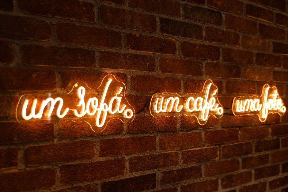
Lighting separates good signs from forgettable ones.
Even if your sign looks great under normal office lighting, strategic lighting—LED strips, backlighting, spotlights—transforms it into a focal point. LED backlighting behind acrylic or aluminum composite panels creates depth and draws the eye. For wayfinding signs, a subtle overhead light ensures visibility even in lower-light corridors.
If you're designing high-traffic interior areas like lobbies, hallways, or retail spaces, assume some variations in lighting conditions. Design your sign to work in both bright and dim environments. Avoid super thin strokes or tiny details that disappear in shadow.
The added benefit: a well-lit sign feels more professional and intentional. It signals that your business cares about the customer experience.
Balance Text and Imagery Strategically
Not every interior sign needs a graphic. But when you use imagery, it should pull its weight.
An icon or simple image can speed up comprehension—an arrow for directional signs, a coffee cup for a break room, a phone symbol for a contact station. But too many graphics clutter your message. Aim for one focal image plus your text, not a collage.
Your logo belongs on signage, but as a supporting element, not the star. A small logo in the corner maintains brand consistency without overwhelming your primary message. The sign's job is to communicate function first, brand second.
Stick to minimal, purposeful design. Every element on your sign should have a reason to exist.
Choose Durable Materials That Look Professional
Interior sign materials matter as much as design. Cheap, flimsy materials undermine even solid design work.
Modern interior signage uses aluminum composite panels (ACM), UV-protected acrylic, or high-quality vinyl. These materials handle foot traffic, temperature changes, and cleaning without warping or fading. They photograph well for brand consistency and project professionalism.
Related: Restaurant Signage Design Ideas That Drive Foot Traffic
Related: Best Restaurant Interior Signage Ideas That Drive Sales
Your choice of material should complement your design. A slick corporate aesthetic calls for aluminum or acrylic. A warm retail environment might lean on wood-textured ACM or natural finishes. Budget-conscious? Vinyl over substrate works well for temporary or changeable signage.
When you're ready to bring your design to life, Wholesale Signs & Printing handles material selection and fabrication so your vision translates exactly to your wall.
Maintain Brand Consistency Across All Signs

One killer sign doesn't matter if your other interior signage clashes with it.
Create a simple sign design standard for your business. Use the same color palette, the same fonts, the same style of imagery. Your conference room sign should visually match your bathroom sign, your reception area sign, and your emergency exit sign. This consistency builds brand recognition and makes your space feel intentional rather than cobbled-together.
Document your choices: approved colors (with hex codes), approved fonts, logo sizing rules, material standards. When you hand off a project to a designer or sign maker, this guide ensures consistency every time.
Inconsistent signage reads as unprofessional and confuses visitors. Consistent signage reads as organized, trustworthy, and branded.
Test Before You Commit
If possible, mock up your design at actual size in the actual location before you finalize the order.
Print a mockup and tape it to the wall where your sign will live. View it from the distances people will actually see it— 3 feet away, 10 feet away, from doorways. Does the contrast hold up? Is the text readable? Does the color feel right next to your walls and existing decor?
This step catches problems before they're expensive mistakes. A color that seemed perfect on your monitor might clash with your paint color. A font size that looked good in the design software might feel cramped in reality.
Getting feedback from colleagues or customers before finalizing is smart. Their first impression tells you if your sign communicates what you intended. When you work with Wholesale Signs & Printing on your project, mockups and proofs are part of the standard process, so you're never surprised by the finished product.
Common Interior Sign Design Mistakes to Avoid
A few quick gotchas to dodge:
- Too much text: If your sign reads like a paragraph, it's trying too hard. Trim ruthlessly.
- Poor font pairing: Don't mix five different fonts for visual interest. One or two, max.
- Ignoring accessibility: Color contrast matters for people with low vision. Design inclusively from the start.
- Skipping lighting considerations: Your sign might look great in a well-lit design mockup but invisible in your actual hallway.
- Using cheap materials: A sign is a physical representation of your brand. Invest in quality. It'll outlast your initial cost many times over.
Putting It All Together
Effective interior signage is the intersection of clarity, contrast, consistency, and craftsmanship. You nail the fundamentals—clear message, readable fonts, high contrast, smart materials—and you've got a sign that works.
Start with your core message. Build around hierarchy and contrast. Keep your design simple and on-brand. Choose quality materials. Test before you commit.
If you're designing interior signage for a multi-location business, a retail space, an office complex, or a healthcare facility, don't wing it. The stakes are higher than they seem. A wayfinding sign that confuses visitors, a promotional sign that doesn't stand out, or a room number sign that's hard to read all cost you credibility and ROI.
That's exactly where a partner like Wholesale Signs & Printing comes in. We handle design consultation, material recommendations, fabrication, and installation—so you get signs that are as functional as they are good-looking. Your interior signage becomes an asset to your business, not an afterthought.
People Also Ask
What's the best size for interior signage?
There's no universal size—it depends on distance and location. A door sign might be 12 inches by 18 inches. A lobby directory could be 24 inches by 36 inches or larger. A good rule: the sign should be readable from at least twice the distance of your viewing area. A sign viewed from 10 feet away needs bigger text than one viewed from 3 feet. Test your mockup at the actual distances people will view it.
Should interior signs have borders or frames?
Simple borders can add polish and make text pop, but they're optional. A clean border helps define the sign's edges and can protect text from visual clutter around it. Skip the border if your design is already strong. If you use one, keep it simple—a thin line that matches your color scheme works better than thick ornamental frames.
What colors work best for interior wayfinding signs?
Dark text on light backgrounds (black on white, navy on light gray) is the safest choice for readability. For a branded feel, you can use your company colors as long as contrast is high. Blues and greens tend to feel calm and professional. Reds and oranges draw attention but can feel aggressive if overused. Test your color combo before committing.
Can I change interior signage later if I need to?
It depends on the material. Vinyl signs are easy to replace. Permanent installations like painted or engraved aluminum are harder and costlier to change. If you think you might rebrand or reorganize soon, choose removable materials like vinyl or modular sign systems. That flexibility saves money down the road.
Wholesale Signs & Printing
Get a Free Quote →