
Your storefront sign is often the first impression customers have of your business. It needs to stop foot traffic, communicate your brand instantly, and make people want to walk through your door. That's a lot of pressure for one sign.
The good news? There's a science to it. When you follow storefront sign design best practices, you're not guessing anymore. You're using proven strategies that increase visibility, improve brand recognition, and ultimately drive more customers to your business.
Let's walk through the core practices that separate high-performing storefront signs from the ones people walk right past.
Start With Readability: The Foundation of Storefront Sign Design
Here's the reality: if people can't read your sign from a distance, they won't. A sign that's hard to decipher loses its entire purpose.
The industry standard is a minimum letter height of 1 inch for every 25 feet of viewing distance. If your storefront is 50 feet from the street, your letters should be at least 2 inches tall. This isn't arbitrary. It's based on human eyesight and how quickly drivers or pedestrians can process text while moving.
Think about where your customers are coming from. Are they driving by at 30 mph? Walking past on the sidewalk? Each scenario demands different letter sizing. Most businesses underestimate this. They choose fonts and sizes that look good to someone standing 10 feet away, then wonder why people don't notice the sign from across the parking lot.
Beyond size, choose fonts that are clean and legible. Script fonts might look elegant in a logo, but they can be nearly impossible to read from a distance. Stick with sans-serif typefaces that are bold and straightforward. Your sign isn't the place to get fancy with your typography.
Color Contrast: Make Your Message Pop
Color contrast is one of the fastest ways to grab attention and ensure readability. High contrast between text and background means people can read your sign in direct sunlight, at night with illumination, and everything in between.
Black text on a white background remains one of the highest contrast combinations. White text on a dark background works just as well. Avoid color combinations like red on brown, green on blue, or any pairing that creates visual strain. These might look trendy, but they fail the fundamental test: can someone read this from 30 feet away?
Your brand colors matter, but readability comes first. If your brand uses a light blue and light gray, those colors won't work together on a sign. Work with your design team to find complementary colors that maintain both brand identity and contrast. Wholesale Signs & Printing can help you navigate this balance, ensuring your sign looks professional while remaining crystal clear from any distance.
Information Hierarchy: Lead With What Matters Most
Your storefront sign has seconds to make an impact. You can't put everything on it. And you shouldn't try.
Start by asking yourself: what does a stranger need to know in the next 3 seconds? Your business name. That's usually it. Your business name should be the largest, most prominent element on your sign. Everything else is secondary.
After the business name, consider what's essential. A tagline that clarifies what you do ("Coffee + Pastries"). Your hours of operation. A call to action like "Walk-Ins Welcome." But keep it minimal. Every additional element competes for attention and dilutes your message.
This is visual hierarchy in practice. Size, color, and placement all work together to guide the viewer's eye in order of importance. A cluttered sign tries to say too much and ends up communicating nothing.
Bold Graphics and Visual Impact
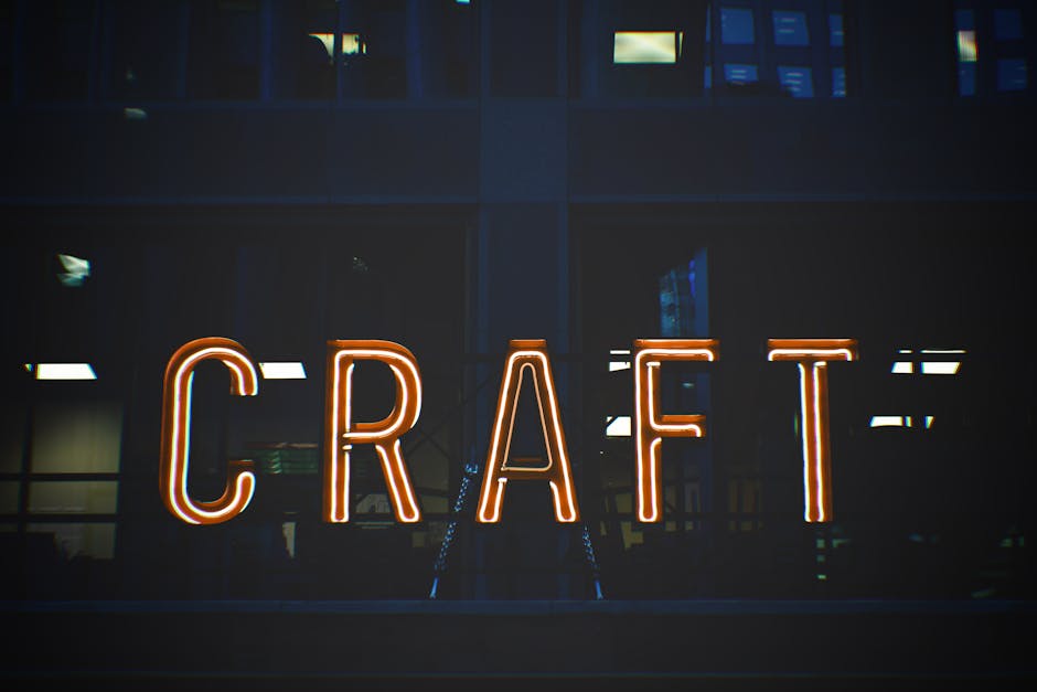
Text alone isn't always enough. Compelling visuals stop people in their tracks.
A well-designed logo, an icon that represents your business, or even a bold graphical element can communicate what you do faster than words. A scissors icon immediately says "salon." A dumbbell says "gym." A wine glass says "bar or restaurant." These visual shortcuts work because they bypass language and speak directly to recognition.
The key is simplicity. Your graphic should be recognizable even if it's small or viewed from a distance. Intricate details get lost. Bold shapes and clear imagery stand out. If you're struggling to describe your graphic in one sentence, it's probably too complicated for a storefront sign.
Brand Consistency Across All Your Signage
When customers see your storefront sign, then your window decals, then your sandwich board, they should immediately recognize that it's all you. Consistency builds brand recognition and professionalism.
This means using the same fonts, color palette, logo, and messaging style across every sign. It doesn't mean every sign looks identical. A window sign can have a different layout than your main storefront sign. But the visual language should be unmistakably yours.
Inconsistency makes you look disorganized or unprofessional. A business that spent time coordinating its visual identity signals that it cares about quality. That perception translates to customer trust.
Choosing the Right Sign Type for Your Location
Storefront sign design doesn't exist in a vacuum. The type of sign you choose depends on your location, visibility needs, and budget.
An illuminated sign makes sense if your storefront gets evening foot traffic or if you're in a location with competing signage. A digital sign lets you change promotions and messaging throughout the day, which is valuable for restaurants or retail. A traditional backlit cabinet sign is durable, professional, and works in most settings.
Some locations allow wall-mounted signs, projecting signs, or A-frame sidewalk signs. Others have strict zoning restrictions. Before finalizing your design, check your local regulations. A stunning sign that violates local ordinances won't help your business. It'll cost you.
Wholesale Signs & Printing handles the regulatory side of this for you. They know local zoning requirements and ADA compliance standards, so your sign is both stunning and legal.
Wholesale Signs & Printing
Get a Free Quote →Design With Your Target Customer in Mind

Not every design works for every business. A luxury boutique needs a different visual approach than a casual diner. A professional service firm needs different messaging than a fitness studio.
Start by thinking about your ideal customer. What appeals to them? What words and visuals resonate? What level of formality do they expect? A law office should feel trustworthy and established. A yoga studio should feel welcoming and calm. Your sign design should reinforce those perceptions.
This is where research helps. Look at successful businesses in your industry. What do their storefronts communicate? What can you learn from them? What will make yours stand out?
Budget Planning and Material Selection
Your budget influences which materials and sign types are realistic.
If you're working with limited resources, vinyl lettering on a painted background or a simple dimensional sign might be the way to go. These can look professional and last for years if maintained. If you have more flexibility, illuminated cabinets or digital displays open up more possibilities.
The key is making an intentional choice based on your priorities. Do you need the sign to last 10 years with minimal maintenance? That might mean investing in higher-quality materials upfront. Are you planning to redesign in a few years? A more budget-friendly option might make sense now.
Discuss budget constraints early in the design process. This keeps the recommendations grounded in reality and prevents disappointment down the line.
Getting Started With a Professional Design Partner
Storefront sign design best practices are clear. But translating them into a sign that works for your specific business, location, and goals requires expertise.
A professional design team will handle the readability calculations, navigate your local regulations, ensure brand consistency, and create a sign that actually drives results. They'll also manage fabrication and installation, so you're not juggling multiple vendors.
Related: Print Marketing Examples That Actually Drive B2B Results
Related: Examples of Print Media Advertising That Drive Real Results
Related: How to Design Effective Interior Signs That Drive Results
When you're ready to move forward, reach out to Wholesale Signs & Printing. They specialize in custom storefront signs that are built to perform. From concept through installation, they handle the details so your sign attracts customers and reflects your brand exactly how you envision it.
What's the ideal letter height for a storefront sign?
Use the 1 inch per 25 feet rule: one inch of letter height for every 25 feet of viewing distance. A sign visible from 50 feet away should have letters at least 2 inches tall. This ensures readability from a distance and accounts for how quickly people process information while moving.
Should my storefront sign match my logo exactly?
Your sign should reflect your brand identity, but it may not need to be an exact replication of your logo. Sometimes logos are too detailed for signage or don't scale well. Work with your designer to adapt your logo for the sign format while maintaining recognizability and brand consistency across all your signage.
How do I know if my sign complies with local regulations?
Check with your local city or county planning department. They can provide zoning guidelines on sign size, placement, illumination, and other requirements. Some areas have strict rules; others are more flexible. Confirm before finalizing your design to avoid fines or being forced to take the sign down.
What's the difference between an illuminated and non-illuminated sign?
An illuminated sign has internal or external lighting and remains visible at night. It's more expensive upfront and requires electrical work, but it extends your visibility 24/7 and can create greater impact. A non-illuminated sign is simpler and more affordable but relies on natural or ambient light. Choose based on your location, foot traffic patterns, and budget.
Wholesale Signs & Printing
Get a Free Quote →