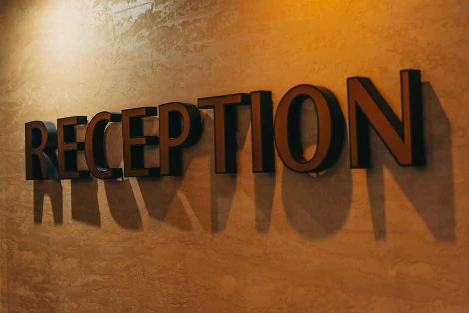
When you're designing a sign for your business, the lettering style you choose matters more than you might think. It's not just about picking a font that looks nice—it's about choosing one that communicates your brand identity, stays legible from a distance, and actually influences how customers perceive your business.
Professional lettering styles for signs fall into specific categories, each with distinct strengths depending on your industry, audience, and the message you want to send. Let's walk through what works, why it works, and how to match the right style to your project.
The Four Main Categories of Professional Lettering Styles
Every professional sign uses lettering that fits into one of four broad style families. Understanding these will help you narrow down your choices fast.
1. Sans-Serif Fonts (Modern & Clean)
Sans-serif means the letters have no little decorative lines (serifs) at the ends. These fonts are modern, straightforward, and easy to read from far away.
Helvetica and Arial are the workhorses of professional signage. You'll see them on corporate buildings, retail storefronts, and wayfinding signs everywhere. They're neutral, trustworthy, and they work in almost any business context.
Franklin Gothic is another classic choice. It's bold and strong without being aggressive, making it ideal for professional services like law firms, real estate offices, and medical practices.
Futura is sleeker and more modern than Helvetica. It has a forward-looking feel that works well for tech companies, design firms, and contemporary brands that want to project innovation.
Related: Vehicle Wrap Design Best Practices: A Professional Guide
Avenir sits somewhere between Futura and Helvetica—contemporary but approachable. It's become increasingly popular for upscale retail and hospitality signs.
2. Serif Fonts (Traditional & Authoritative)
Serif fonts have those small decorative lines at the ends of letters. They feel more traditional, established, and formal. They project stability and heritage.
Garamond is elegant and refined. It works beautifully for luxury brands, boutiques, law offices, and heritage businesses that want to communicate experience and trustworthiness.
Bodoni is the style choice when you want exceptional stylish appearance. With sharp contrasting thick and thin lines, Bodoni says "premium" and "refined." It's perfect for high-end salons, upscale restaurants, and luxury retail.
Times New Roman is more conservative than Garamond or Bodoni, but it's incredibly legible and carries a sense of authority. You'll see it used by established institutions, government offices, and professional service providers.
3. Script & Calligraphy (Elegant & Creative)
Script lettering mimics handwriting and calligraphy. These styles add personality and elegance but need to be used strategically because they can sacrifice legibility if they're too ornate.
Hand lettering and calligraphy work best when they're combined with clean, simple sans-serif text for the main message. A wedding venue might use elegant script for the business name but sans-serif for the address and phone number.
Watercolor lettering and other decorative techniques create visual interest and differentiation. These work especially well for creative industries like design studios, photography businesses, and boutique hospitality.
4. Fancy & Display Fonts (Bold Statements)
Bebas and similar display fonts are extra bold and architectural. They demand attention and work best when you have limited text and want maximum impact.
These fonts shine on retail signs, entertainment venues, and brands that need to stand out in a crowded visual space. But use them sparingly—they're hard to read in small sizes or from long distances.
How to Choose the Right Professional Lettering Style for Your Sign
The best font for your sign depends on three things: your industry, your brand personality, and how far away people will read your sign.
Match Your Industry
A law firm needs something that says "professional and stable." That's Garamond or Times New Roman. A yoga studio needs something that feels approachable and modern—maybe Avenir or Futura with clean, minimal styling.
A high-end salon wants elegance and refinement. Bodoni with its dramatic thick-and-thin contrast sends exactly that message. A casual coffee shop works better with friendly, rounded sans-serif like Avenir.
Distance & Legibility
Here's the rule: the farther away people read your sign, the simpler and bolder your lettering needs to be. A nameplate on a door can use intricate script. A sign visible from 50 feet away needs big, clean sans-serif.
Helvetica and Franklin Gothic are industry standards for long-distance readability because of their clear letterforms and good spacing. Script fonts should only be used for accent text, not primary messages, when distance is a factor.
Brand Alignment
Your lettering style should match your brand personality. Tech companies typically avoid serif fonts because they feel dated. Luxury brands often use serif or script because they communicate exclusivity. Conservative professional services lean toward classic sans-serif or serif.
The goal isn't to pick the "best" font in general—it's to pick the one that makes your specific business look and feel right to your target audience.
Professional Lettering Beyond Standard Fonts
Standard fonts are just the beginning. Professional sign makers also use hand lettering, dotted lettering techniques, specialty finishes, and mixed typography to create custom impact.
Hand lettering adds personality and uniqueness that no standard font can match. A hand-lettered sign feels crafted and intentional, which is why boutiques, artisanal food businesses, and creative services use it so often.
Watercolor lettering and painted effects create texture and visual depth on interior signs, especially in hospitality and retail. These techniques are more expensive but create memorable, Instagram-worthy results.
Combining multiple fonts—a bold sans-serif headline with elegant script accent lettering—lets you get the best of both worlds: impact plus refinement. This mixed approach is hugely popular in contemporary professional signage.
If you're working on a complex design with multiple lettering styles or custom hand lettering, Wholesale Signs & Printing can help you test options and create mockups before fabrication. Professional design guidance matters when you're mixing styles.
Wholesale Signs & Printing
Get a Free Quote →Related: Sign Installation Permits & Regulations: A Complete Guide
Related: Sign Repair in Costa Mesa, CA: Complete Guide
Related: How to Brand Your Storefront With Signs: Complete Guide
Common Professional Lettering Applications
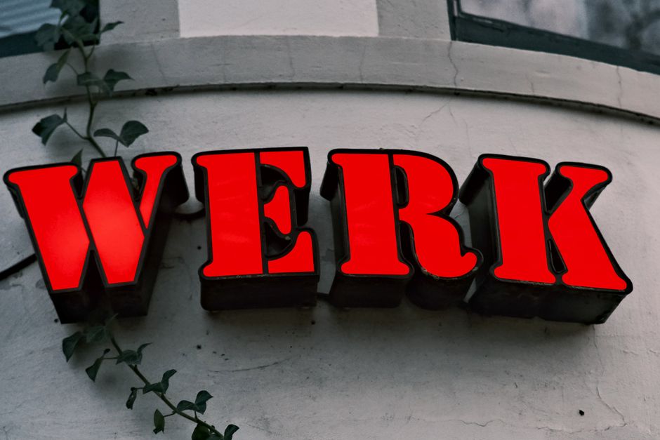
Different business types have become associated with specific lettering styles for good reason.
Corporate & Professional Services: Helvetica, Arial, Franklin Gothic. These communicate stability and professionalism without personality clashes.
Luxury Retail & Hospitality: Bodoni, Garamond, script accents. The elegant serif or refined script says "premium."
Tech & Modern Businesses: Futura, Avenir, contemporary sans-serif. Clean and forward-looking.
Heritage & Established Institutions: Times New Roman, classic serif, traditional scripts. Communicates history and reliability.
Creative & Design Firms: Mixed typography, hand lettering, custom styles. Showcases expertise and originality.
Casual Retail & Food: Friendly sans-serif, rounded letterforms, occasional script accents. Approachable and welcoming.
Letter spacing and typeface choice have measurable impacts on how quickly people process information and form impressions. Professional signage follows these same principles.
Technical Considerations for Professional Sign Lettering
Choosing a style is step one. Actually producing it requires understanding how different fonts work in different mediums.
For channel letter signs (the dimensional letters you see on storefronts), you need fonts with clean, simple letterforms that won't create weak points or manufacturing issues. Helvetica, Franklin Gothic, and Futura are favorites because their geometry translates perfectly to fabrication.
For vinyl lettering and decals, script and decorative fonts work better because there are fewer fine details that get lost during cutting. The medium actually allows more creative freedom here.
For painted signs, hand lettering and specialty techniques become practical options because a skilled painter can create effects that digital files can't replicate.
For backlit signs, sans-serif fonts with consistent stroke weight work best because thick and thin contrasts can create odd lighting effects.
When you're planning a sign project, the lettering style needs to work not just aesthetically but practically within your chosen medium and production method. That's where working with experienced sign professionals makes the difference. Wholesale Signs & Printing can advise on which lettering styles translate best to your specific fabrication needs.
Combining Multiple Lettering Styles in One Sign
Many professional signs use two or three lettering styles together—a bold sans-serif for the main message and an elegant serif or script for secondary text or accents.
The key is contrast. If you're combining Helvetica and Garamond, make sure the weights and sizes are clearly different so they look intentional, not like a mistake.
A classic combo: Franklin Gothic bold for the business name, Garamond for the tagline or category descriptor. Or Futura for the main headline with a delicate hand-lettered accent element.
The rule is don't use more than three distinct styles in one sign, and make sure they have different weights or purposes so they feel like they belong together.
How to Test Lettering Styles Before Committing to Fabrication
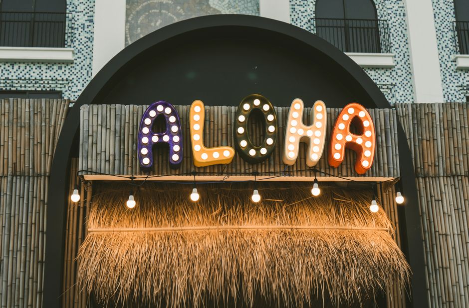
Never fabricate a sign without seeing the lettering style at actual size and proportion first.
Ask for digital mockups showing your lettering choice in the actual sign layout, at the actual dimensions you're planning. This reveals legibility issues and visual balance problems that small screen previews hide.
If possible, see it printed large-scale on paper or vinyl mockup material. Lettering looks different when you're standing in front of it versus looking at a small screen.
Test it from the distance where people will actually read it. A font that looks great at two feet might be illegible from 30 feet away.
Professional sign designers at Wholesale Signs & Printing build mockup and approval time into their process because they know this step prevents expensive mistakes.
Trending Professional Lettering Styles in 2026
The fundamentals haven't changed—sans-serif still dominates corporate signage, serif still communicates luxury—but there are some notable trends worth knowing.
Geometric sans-serif fonts like Futura and Avenir are more popular than ever as brands want to feel contemporary and clean.
Mixed typography (combining two complementary styles) has become standard practice rather than experimental. It's expected now, not trendy.
Hand lettering and custom type is making a comeback as a differentiator. When every corporate sign uses Helvetica, hand lettering stands out.
Variable font weights within the same typeface let designers create visual hierarchy without switching fonts. This sophisticated approach is becoming more common in high-end professional signage.
Oversized, almost illegible lettering as a design statement is having a moment in retail and hospitality, but it requires skill and context to pull off without sacrificing actual readability for the key information.
Key Takeaways for Professional Sign Lettering
Pick a lettering style that matches your industry and brand personality. Sans-serif for modern and corporate. Serif for luxury and established. Script for elegance and creativity. Display fonts for bold statements.
Prioritize legibility from the distance where people will actually read your sign. Clean, simple letterforms beat decorative complexity when distance matters.
Test your lettering choice at full size and full distance before you commit to fabrication. Small screen previews hide real-world problems.
Mix complementary styles intentionally when you want visual interest, but keep combinations to two or three distinct fonts with clear contrast in size or weight.
Consider how your chosen lettering style will work in your specific medium—channel letters, vinyl, paint, backlit, etc. Not every font works in every production method.
FAQ: Professional Lettering Styles for Signs
What is the most professional lettering style for business signs?
Helvetica, Arial, and Franklin Gothic are the most universally professional choices because they're clean, legible, and convey stability without personality clashes. Helvetica specifically has been used in professional signage for over 60 years and remains the default standard. For luxury or established businesses, Garamond or Bodoni adds refinement. The "best" choice depends on your specific industry and brand positioning, but you can't go wrong starting with a classic sans-serif.
Should I use a serif or sans-serif font for outdoor signs?
Both work for outdoor signs, but your choice depends on distance and weather. Sans-serif fonts like Helvetica and Futura are slightly more legible from far distances because their letterforms are simpler and cleaner. Serif fonts like Garamond work fine for outdoor signs but need to be large enough that the serifs don't disappear due to distance or glare. For signs visible from 50+ feet, sans-serif has a slight advantage. For close-range signage like storefronts, both perform equally well.
Can I use script lettering for my main sign text?
Script lettering works best as an accent or secondary text, not as your primary business name or main message. Script reduces legibility, especially at distance or in bright sunlight. Use script for a tagline or decorative element, then pair it with clean sans-serif for the main information. This combination gives you elegance plus readability. If your business name is short and will be read from a close distance, decorative script can work as primary text—but test it at actual size and distance first.
How do I know if a lettering style will be readable on my sign?
The best test is a full-size mockup at the actual viewing distance. Ask for a large-format print or vinyl mock-up of your design, then view it from the distance where people will actually read it. Your eyes will immediately tell you if it's legible. General rules: thicker letterforms are more readable; simpler fonts are more readable; higher contrast between letters and background increases readability; and larger sizes obviously work better. If you can't read it comfortably from the intended distance during testing, the design needs adjustment before fabrication.
Wholesale Signs & Printing
Get a Free Quote →